
Company
Rebranding
implantcast new Design
The new design is coming!
From now on we appear even clearer, more self-confident and globally uniform(er).
The last revision of our design took place in 2001. Since then, we have grown and developed continuously. For our new design, we have retained proven elements, combined them with new ones and positioned them in such a way that we can communicate flexibly on all channels.
The "cloverleaf" is implantcast's visual symbol. We remain true to it. As well as to the intention of our slogan. "walk with us." is our promise to act reliably and in partnership at eye level. We seek and value personal exchange for innovative, optimal solutions.
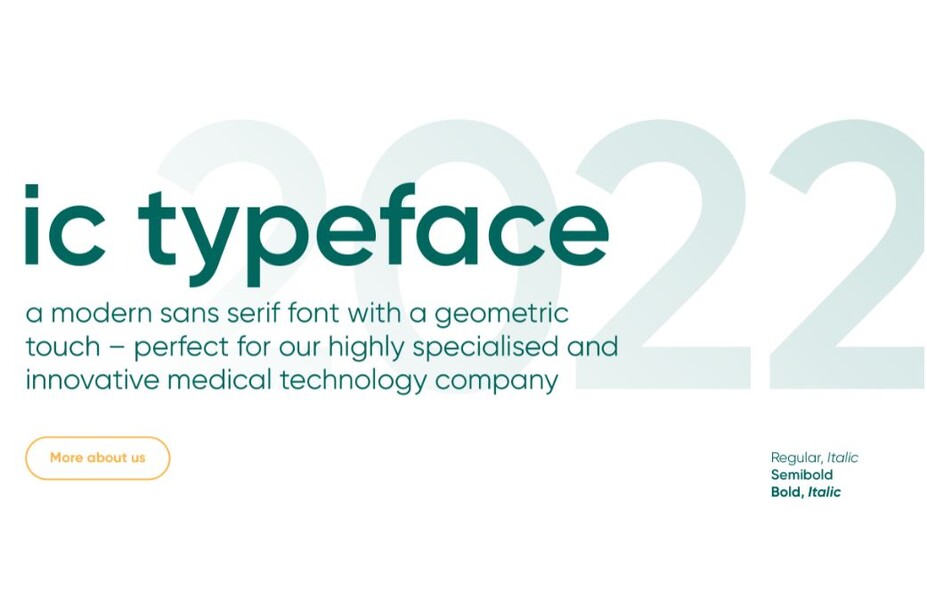
The central element of the new design is the "implantcast" typeface, a modern sans serif with a geometric touch. It is not only beautiful, but also informs in almost all languages. Our icons are characteristically integrated into the communication as visual signposts.
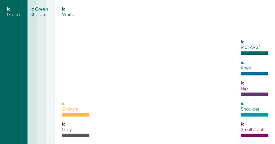
We use colours as an orientation system. We have adapted our corporate colours for this purpose, for clear use with a lot of white space. The colours of our product branches are new: strong and dynamic, they draw attention to our competences across all areas of endoprosthetics.
The quality, functionality and aesthetics of our endoprostheses speak for themselves. That is why we do without a set when staging the products and show them off in the original in dynamic perspectives.
Next steps
We are gradually introducing to the new design. This means that from now on, all materials and templates that are due for revision or a new edition will be redesigned. The new design will be implemented by us as well as by our subsidiaries and partners. For our customers and the public, the new design will be visible from spring 2022.